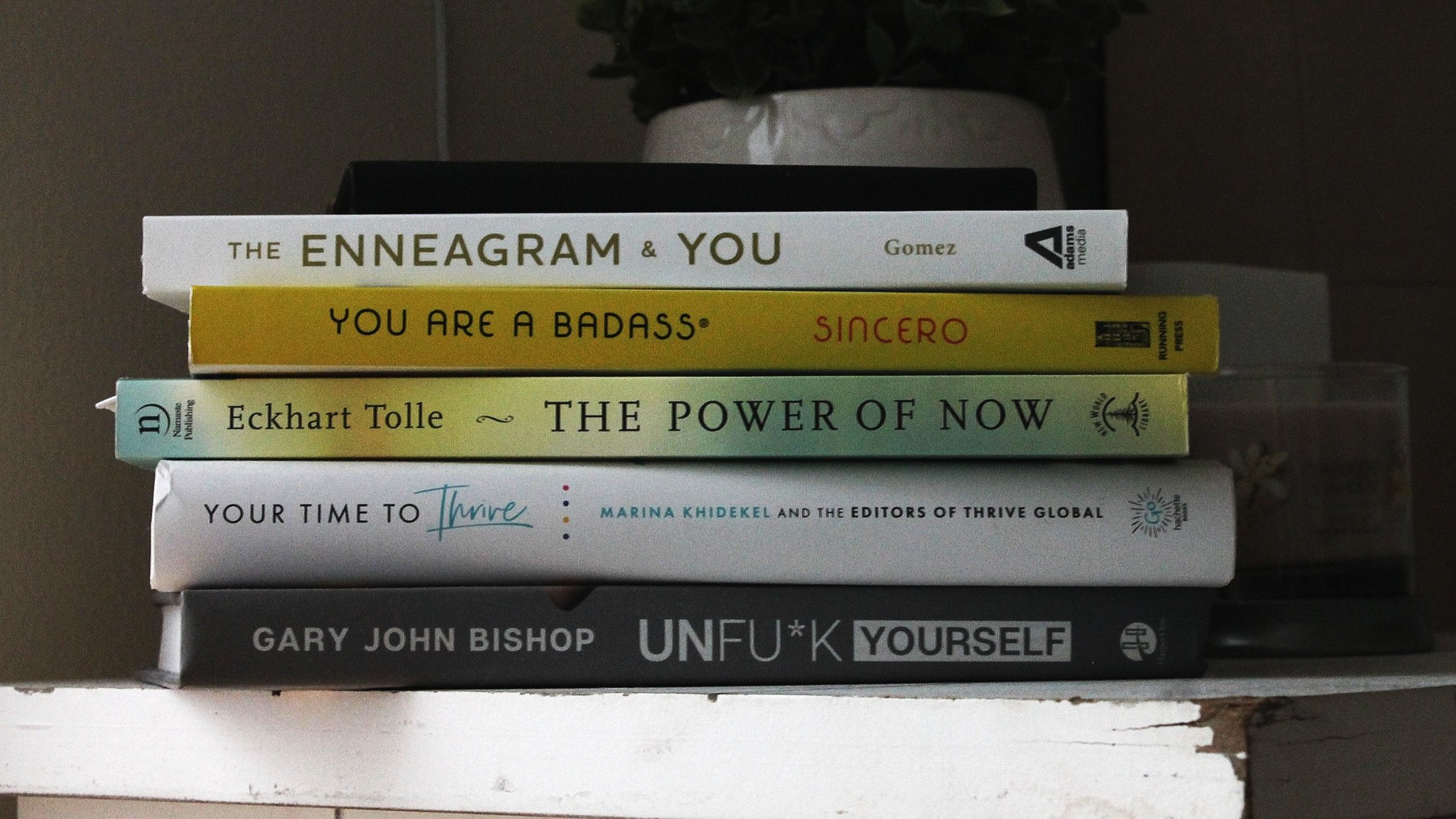
What To Know About Typography For Non-Designers
Typography is a critical element of graphic design that plays a vital role in enhancing any design's visual appeal and effectiveness. Typography refers to the art and technique of arranging type, font style, size, and spacing to create visually appealing designs that communicate a specific message or brand identity.
Here are some key reasons why typography is essential in graphic design:
Establishes brand identity: Typography helps to create a unique brand identity by using distinct fonts and typefaces that reflect the personality and values of a brand. Consistent use of typography across all marketing materials reinforces brand recognition and helps build customer trust and credibility.
Communicates information: Typography is a powerful tool for communicating information effectively. The right choice of font and typography layout can help to convey a message or story, attract attention, and improve readability.
Sets the tone: Typography sets the tone for a design by creating a visual mood that conveys the intended message. Different typefaces can evoke different emotions and feelings, so choosing typography that aligns with the design’s intended tone and message is important.
Improves legibility: The use of typography can enhance legibility, making it easier for viewers to read and understand the content. Good typography uses appropriate font sizes, line spacing, and letter spacing to create readable text blocks.
Adds visual interest: Typography can add visual interest to a design by using different font styles, sizes, and colors to create visual hierarchy and contrast. This helps to draw the viewer's attention to specific elements of the design and can make it more engaging and memorable.
“Typography is what brings text to life.”
To get started in typography, you first should know the essential typographical design elements.
Fonts and typefaces
A typeface is a design style that comprises a number of characters of varying sizes and weights, whereas a font is a graphical representation of a text character.
A typeface is a family of related fonts, while fonts refer to the weights, widths, and styles that constitute a typeface.
There are three basic kinds of typeface: serif, sans-serif, and decorative.
Contrast
Contrast helps to convey which ideas or messages you want to emphasize to your readers.
Most designers create contrast by playing with varying typefaces, colors, styles, and sizes to create impact and break up the page.
Consistency
Keeping your typefaces consistent is key to avoiding a confusing and messy interface.
White space
White space is the space around text or graphics. White space ensures the interface is uncluttered and the text is readable.
Alignment
Alignment is the process of unifying and composing text, graphics, and images to ensure there is equal space, size, and distance between each Color
Color is one of the most exciting elements of typography. This is where designers can really get creative and elevate the interface to a new level.
The font color can make the text stand out and convey the tone of the message, but choosing the wrong color can result in messy text and design.
Hierarchy
Establishing a hierarchy is one of the most vital principles of typography.
Typographical hierarchy aims to create a clear distinction between prominent pieces of copy that should be noticed and read first, and standard text copy.
Hierarchy can be created using sizing, color, contrast, and alignment.
The most typical example of a typographical hierarchy is size: headings should always be larger than subheadings and standard text.
I hope that reading this has opened a new door to typography or has given you some new knowledge!
Sources:

